introduction
CWS is a private medical practice specializing in psychiatric and weight management care. Founded and run by a dual board-certified psychiatrist and obesity medicine specialist, CWS offers compassionate, individualized treatment plans that address both mental health and weight management.
Their mission is to improve the overall health and quality of life of their patients by using evidence-based, comprehensive care that helps to achieve lasting wellness.
Project Overview
As this practice is new and run solely by its founder, the bare minimum was done to define the look, sound, and feel of the brand. I was hired as a freelancer to re-brand CWS: provide clear brand guidelines, establish tone & voice, and launch a new website. By creating a clear, defined brand, I helped to put the train on the tracks and provided direction for the founder to grow his practice.
Mission of CWS provided by client: Providing compassionate, personalized care for mental health and weight management, helping patients achieves lasting wellness through evidence-based treatment.
The Challenge
- Work with client’s vision and hopes while balancing my expertise to deliver best result
- Design new logo that will be recognizable
- Define brand visuals, tone, and voice to create clear guidelines that can be followed across channels
- Launch new website to communicate brand’s UVP and story while encouraging visitors to sign up for initial appointment
The Process
- First meeting with client established their needs and goals
- Written proposal to specifically outline my deliverables and timeline
- Conducted research in order to best identify this brand’s UVP
- Designed options for logo and submitted for client approval
- Created branding guideline presentation for client approval
- Launched website with requested pages, content, and sign up form
Skills
- GoDaddy
- WordPress
- Canva
- Research
- Copy Writing
- Client Management
Starting Piont
What problems am I trying to solve?
Name
The initial name for the practice was “Compassionate Weight Solutions” which brought two main problems:
- Name only communicates a portion of the services provided by the practice while completely ignoring the other
- Resulting domain was so long, it hindered search-ability and SEO
Website
The first website was very barebones and felt dated. It had the minimum you would look for: contact info, FAQs, short ‘About’ section. But it offered nothing in the way of value. It also did not communicate UVP or why a viewer should choose to work with this physician.
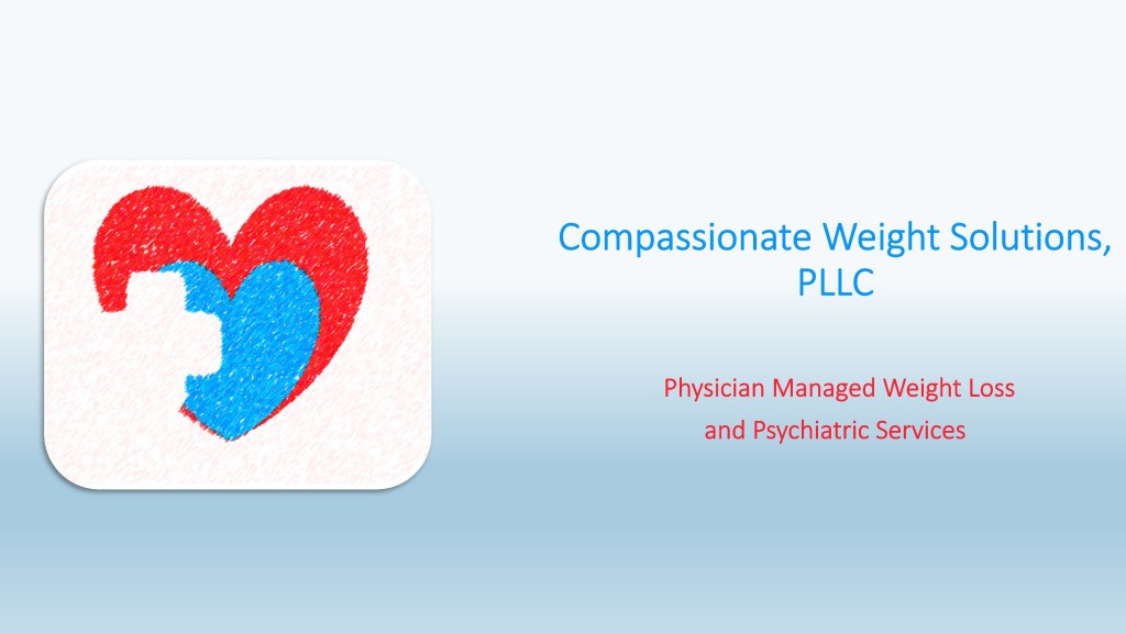
Logo
The logo (pictured below) was fairly simple and did nothing to entice viewers. Nor did it communicate effectively what this practice is or what it offers. It was also forgettable.
Content
The content provided on the website was nothing special. The tone was clinical and unapproachable. And the only information on the site pertained to appointments- this information (pricing, mostly) was overwhelming and felt prohibitive. With nothing to demonstrate the value, there would be no reason for viewers to click through.
First logo
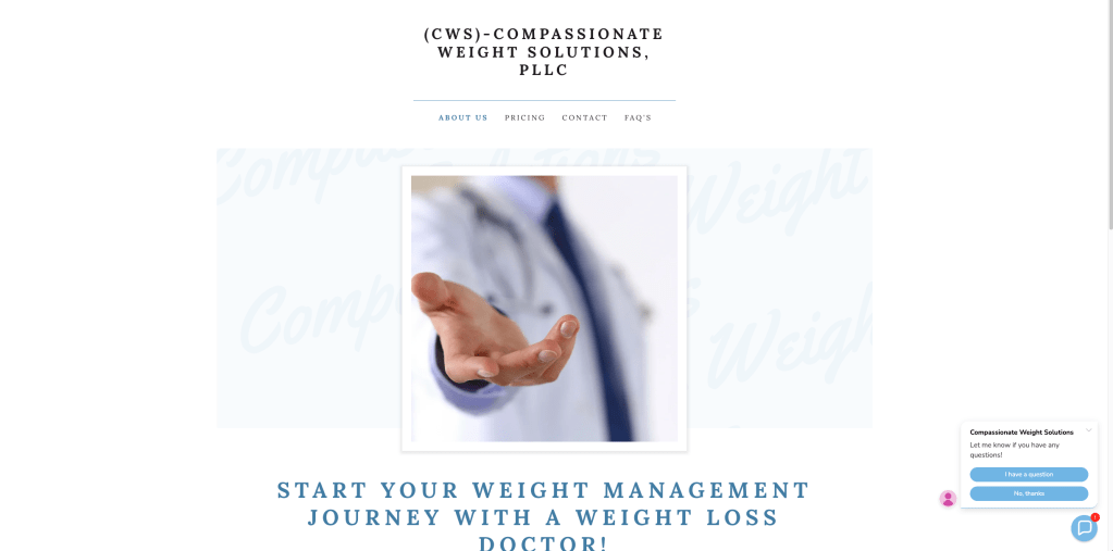
Original Homepage
deliverables & timeline
new logo
Brand Guidelines
Website Plan
Launch Website
New Logo Design
The challenge was trying to find a way to effectively communicate what CWS does with the visual of the logo and the name. The first choice the client and I made together was to shorten ‘Compassionate Weight Solutions” to CWS and utilize the domain CWSClinic.com. Taking this in to account for the design, I also wanted to bring in joy and energy to the look of CWS’s logo. I set out to craft a logo that would communicate this is a practice that is welcoming, supportive, and optimistic. I selected a graphic with an abstract human figure stretching upward combined with a an open gesturing hand to create a ‘C’. This could then be used for the full ‘CWS’ or on it’s own.
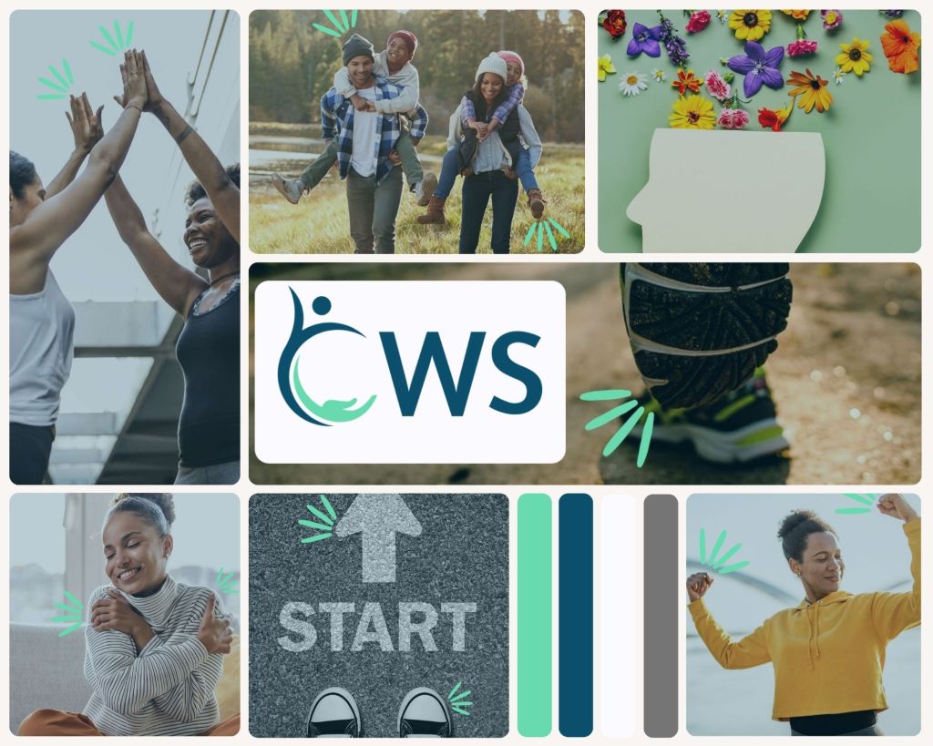
Mood Board
Shared this with the client to communicate the vibe and direction I wanted to take the brand: joy, optimism, diversity, fresh feeling.
Define the Brand
Competitor Research
messaging
Brand Guidelines
Competitor Research
Conducting research in to various competitors revealed most “practices” that offer weight management services are not medically run. I found one that was and utilized that for my main research. This provided insight to what makes CVS special and aided in crafting the messaging to highlight these unique offerings.
Competitor Strengths:
- Take insurance
- Well established
- Large business, more resources
Competitor Weaknesses:
- Impersonal
- Only focuses on weight
- Messaging can feel problematic- only way to happiness is to lose weight
Messaging
UNique Value Proposition (UVP)
Led by a dual board-certified physician in Psychiatry and Obesity Medicine, Compassionate Weight Solutions offers evidence-based, personalized care that addresses both the mind and body — helping you achieve sustainable wellness with empathy, expertise, and respect.
Key Values
- Trust & Respect
- Patient-Centric Approach
- Compassion & Understanding
Tagline
Personalized Care for Lasting Wellness
Brand Guidelines

VOice & Tone
- Approachable & Professional
- Encouraging & Caring
- Supportive & Trustworthy

Tone
- Optimistic & Uplifting
- Insightful & Helpful
- Respectful & Adept

IMagery
- Coordinate with brand colors
- Diversity of people (body type, skin, age, gender)
- Joy, Positivity, Encouragement
- No negative representations of weight or mental health
- Graphics can be used, must be in brand colors

New Website
With branding approved by the client, an outline was made for the new website. The goal being for the website to communicate who CWS is, what they provide patients, and, most importantly, why patients should choose CWS over other options.
The main pages making up the website are: Homepage, About Us, Services, Patient Resources, and Connect. Each aimed at guiding a viewer through the traditional journey of Awareness, Consideration, and through to Conversion (submitting a patient request form).
About CWS
The biggest problem with the previous website was it only highlighted the weight management service and completely ignored the psychiatry side of the practice. No other practice is doing both, let alone being led by a dual-board certified physician.
The goal for the new ‘About’ page is to communicate this unique feature while sharing it in an approachable, enticing way.

Services
CWS’s previous site contained an overwhelming list of every type of service possible along with pricing. There was no messaging conveying the value of these services. It became important for the new page to simplify the offerings while communicating the value and providing options for further information if desired.
Patient Resrouces
This page was the biggest addition. CWS’s original website had no additional value for viewers or patients. This page provides a link to the existing patient portal, articles of relevant studies, FAQs, and patient testimonials. Not only does this page offer more information and content to existing patients, it is still providing evidence and content to guide viewers through the funnel to convert and become patients.

connect
Making the “Become a Patient” form was my biggest challenge. As this is the only way my client could receive new leads, it was also arguably the most important piece. I utilized WPForms plugin in order to craft a form that would provide the information my client needs to contact leads and follow up with them. After some trial an error, we did confirm the form is working and easy to use.
reflection
I found this process incredibly rewarding. Taking a brand that has a solid, clear mission and translating that in to visual and tonal messaging helped me feel like I actually made a positive impact. I was able to take their ideas and craft something that look professional and conveys what this brand is, why it’s special, and that feels very clear now.
Working with this client was a great experience. They gave me the creative leeway to make suggestions while clearly communicating what they needed and if they didn’t like something. We worked together well, and I felt we had a good balance.
This website launched this week (April 28th, 2025) so I don’t have data to look at yet to analyze the impact these changes have made. However, I look forward to checking in with my client in a bit and hearing how it’s all going!